Coffee Chat Operations Dashboard
Identified a manual workflow bottleneck inside MSTI's ambassador program, validated the problem through stakeholder interviews, mapped the full process in FigJam, and shipped a dashboard now actively used by 8 MSTI faculty members.
TIMELINE
Jan 2025 to Jun 2025
TEAM
UW MSTI GIX
ROLE
PM Intern
METHODS
Stakeholder Interviews, FigJam, Workflow Mapping, Prototyping, HTML/CSS/JS, Claude AI
LONG STORY SHORT
Conducted 8 stakeholder interviews (6 ambassadors + 2 faculty) to surface friction points in the existing workflow before touching any tooling.
Mapped the full end-to-end process in FigJam, identified 3 high-friction manual steps, and scoped the prototype around the highest-ROI interventions.
Shipped a coordinator dashboard and ambassador portal now actively used by 8 MSTI faculty members, with a 91% satisfaction rate from staff who adopted the tool.
THE CHALLENGE
How might we give MSTI coordinators real-time visibility into 100+ coffee chat requests and reduce the manual overhead ambassadors spend drafting emails, tracking status, and submitting feedback?
CONTEXT
The program was growing faster than the process
MSTI's Coffee Chat Program connects prospective students with current MSTI ambassadors for one-on-one conversations about the program. At its peak, coordinators were managing 100+ requests per semester across a SharePoint spreadsheet, manual email chains, and a Microsoft Form for post-chat feedback.
The program worked but the workflow behind it was held together manually. Every step from assignment to feedback collection required someone to copy, paste, update, and follow up by hand. During the program's busiest weeks, things slipped through.
My role was not to rebuild the program from scratch. It was to observe the existing workflow, find where the team was losing the most time, and determine whether a lightweight tool could recover it.
DISCOVERY
Observe first, build second
Before proposing any solution, I ran 8 structured stakeholder interviews over two weeks 6 with student ambassadors and 2 with faculty coordinators. Each session followed the same prompt: "Walk me through what you actually do when a new request comes in, step by step."
I was specifically listening for three things: where time was being lost, where ownership was unclear, and what tasks felt repetitive enough that people had developed workarounds. I wasn't leading toward a solution I was mapping reality.
8
Stakeholder interviews
6 ambassadors · 2 faculty
3
High-friction steps identified
Email drafting · Status tracking · Feedback collection
~20min
Lost per coordinator per week
Just on manual status updates
Student intake form on the MSTI website. Each submission became a row in the shared tracker.
Original SharePoint spreadsheet with no ownership column, no status pipeline, and no SLA visibility.
Three friction points surfaced consistently across nearly every interview:
Manual email drafting
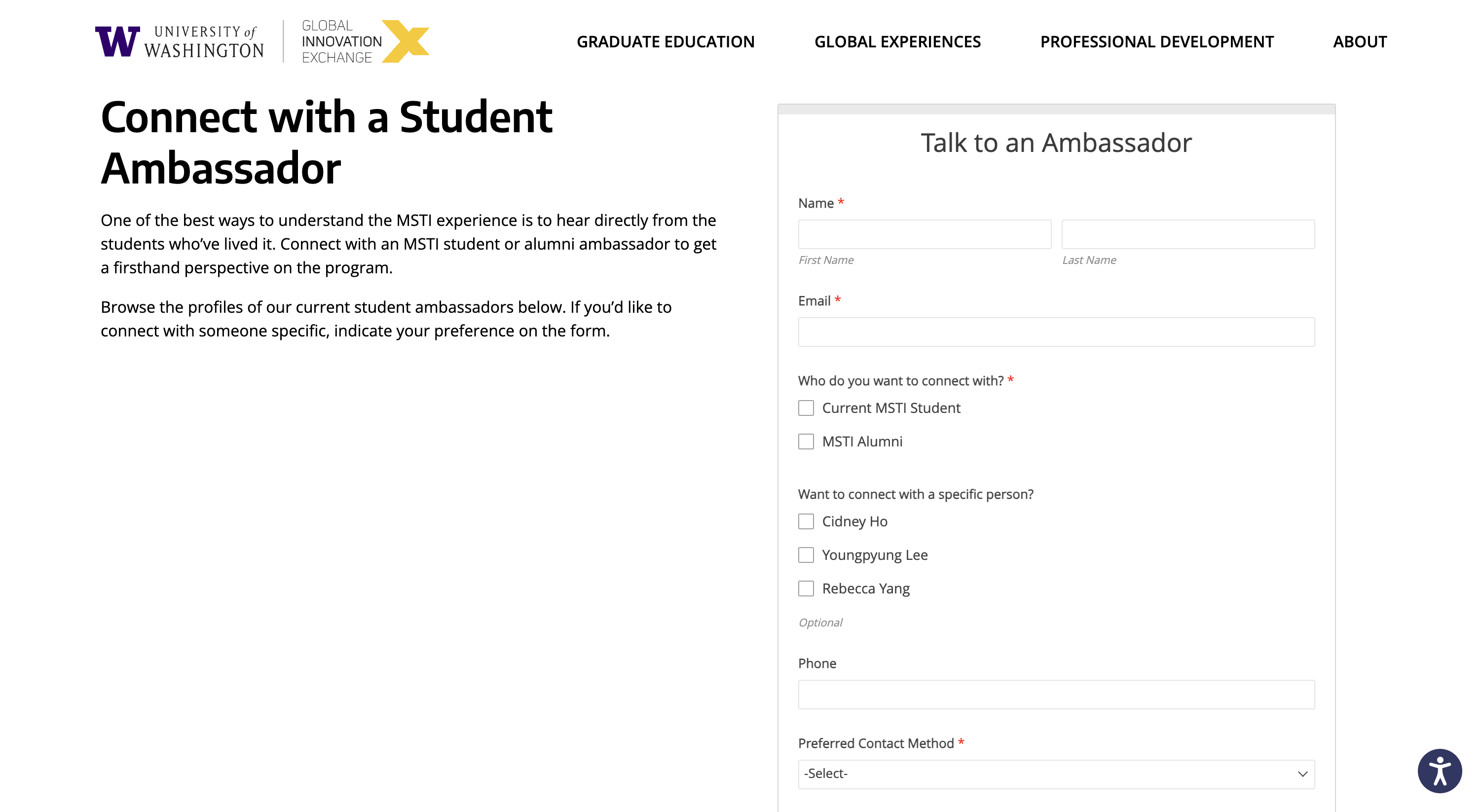
Ambassadors had to open Outlook, copy a format from a separate document, manually fill in the student's name and details, and send. There was no template, no pre-fill, and no record of whether it was sent. Several ambassadors said they occasionally forgot which requests they'd already emailed.
No coordinator visibility
The SharePoint spreadsheet showed what was assigned, but not what was happening after assignment. During peak season, coordinators had no way to see at a glance which requests were stalled, which were in progress, and which had completed without manually reading every row.
Disconnected feedback collection
Post-chat feedback was sent via a separate Microsoft Form one week after the chat manually, by the coordinator. The feedback data lived in a separate file and was never systematically connected back to the original request or ambassador. Identifying trends across feedback required hours of manual cross-referencing.
WORKFLOW MAPPING
Turning observations into a process map
After the interviews, I mapped the full end-to-end workflow in FigJam both the coordinator flow and the ambassador journey to make the friction visible to everyone, not just to me. The goal was to give the team a shared picture of reality before we discussed what to fix.
The existing process had 9 steps from form submission to feedback collection. Three of them highlighted in the map were purely manual and offered no visibility to anyone else:
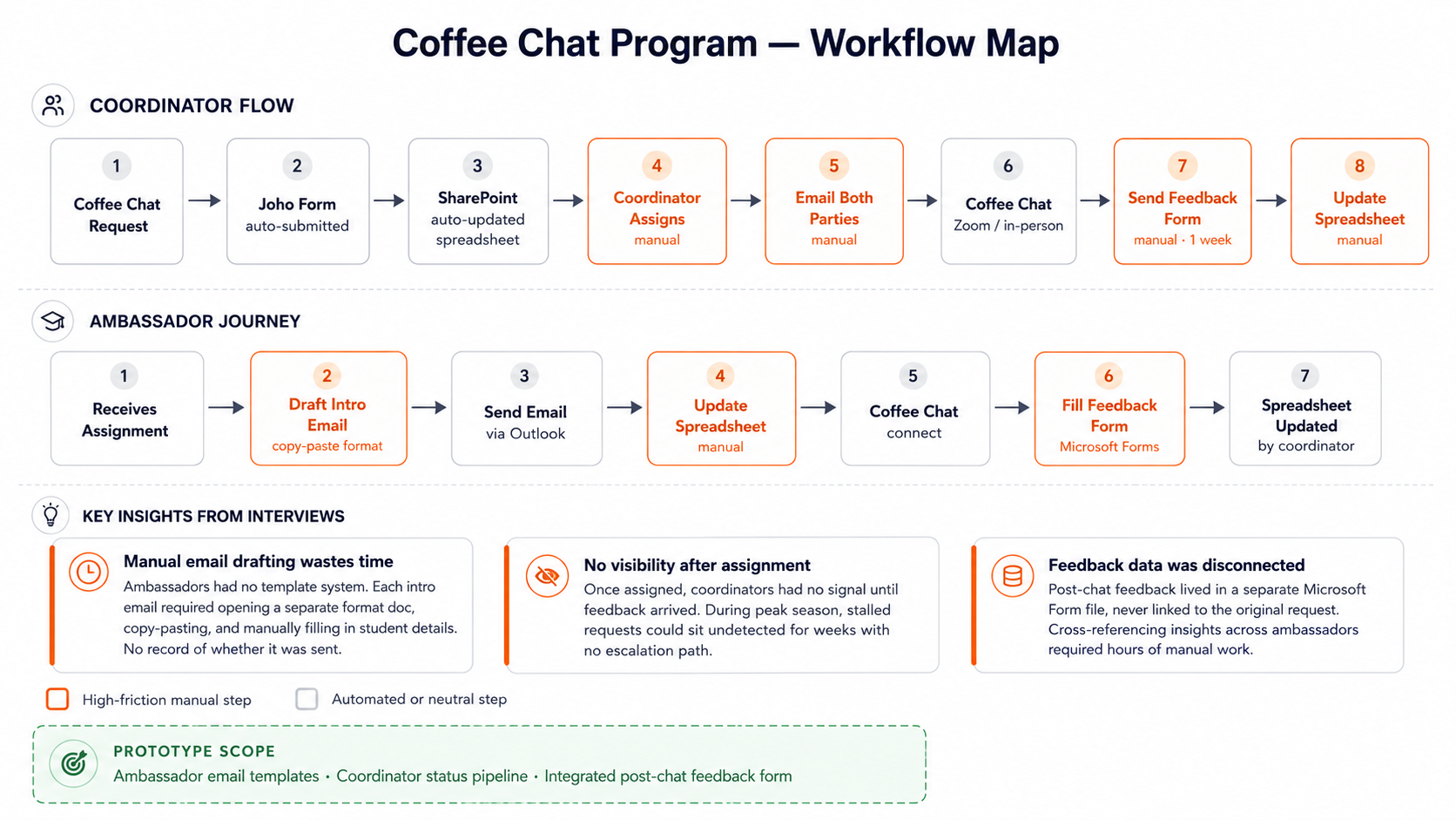
FigJam workflow map red nodes indicate manual, high-friction steps with no visibility to coordinators
The FigJam map also surfaced something the interviews alone didn't fully capture: the ambassador journey was almost entirely invisible to coordinators. Once an assignment was made, there was no signal about whether the ambassador had reached out, whether the chat had happened, or whether anything had gone wrong until the feedback form was manually sent a week later.
This became the core design constraint: the solution needed to give coordinators real-time visibility into ambassador actions without changing how ambassadors worked.
SCOPING
Deciding what to build and what to leave out
With the friction map in hand, I evaluated each pain point against three questions: How much time does this cost? Can it be solved without a backend? Will the team actually use it?
01
Observe
Mapped the full workflow from form submission to feedback collection
02
Interview
8 stakeholder sessions to identify where time was lost and ownership broke down
03
Scope
Evaluated friction points by time cost, buildability, and adoption likelihood
04
Ship
Built and deployed a working dashboard with AI-assisted tooling, no engineering team required
I scoped the prototype around three targeted interventions one per major friction point and explicitly left out anything that would require replacing the existing SharePoint workflow or adding backend infrastructure. The constraint wasn't technical. It was adoption: the team needed to see value within days, not weeks.
In scope
- →Coordinator request pipeline with real-time status
- →Ambassador portal with pre-filled email templates
- →Post-chat feedback form built into the ambassador flow
Out of scope
- •Replacing SharePoint as data source
- •Automating email sending (no backend)
- •Full authentication system
Success criteria
- →Reduced manual steps for ambassadors
- →Coordinator can see status without opening spreadsheet
- →Feedback data attached to original request
BUILD & SHIP
Building and deploying the dashboard without an engineering team
Rather than writing a requirements doc and waiting for an engineering sprint, I built the prototype myself using AI-assisted tooling. The approach: describe the interface, iterate on the output, validate with users, repeat. This let me put something real in front of stakeholders within days of scoping not weeks.
The prototype is a two-view web dashboard. The coordinator view gives program staff a real-time pipeline of all requests status, days in stage, stall flags, and ambassador assignment replacing the need to manually read the spreadsheet. The ambassador portal gives student ambassadors a personal queue with pre-filled email templates and a built-in post-chat feedback form, replacing the manual Outlook copy-paste workflow.
Coordinator Dashboard
- →Status pipeline: Pending, Intro Sent, Confirmed, Completed, Feedback
- →Stall detection: flags requests with no update in 5+ days
- →Ambassador assignment with preference matching (student vs. alumni)
- →Export to CSV for end-of-semester reporting
- →Real-time stats: total requests, pending count, stalled count, feedback rate
Ambassador Portal
- →Personal queue showing only assigned requests
- →Pre-filled intro and follow-up email templates with GIX signature
- →One-click email preview and copy
- →Post-chat feedback form (6 questions, built into the completion flow)
- →Activity log showing full history per request
LIVE PROTOTYPE
The dashboard is live and interactive
The dashboard is deployed and live. Switch between coordinator and ambassador views, assign ambassadors, trigger email templates, and submit post-chat feedback all in the browser, no login required. This is the same tool currently used by 8 MSTI faculty members.
VIEW LIVE DASHBOARD →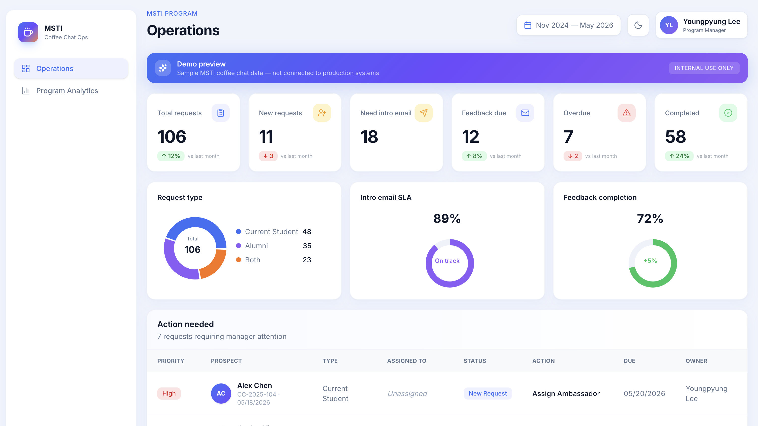
Coordinator view request pipeline with status badges, stall flags, and ambassador assignment
VALIDATION
Deployed and adopted by the team
Once the prototype reached a functional state, I ran it through two rounds of testing. The first was a walkthrough session with 3 ambassadors I asked them to complete a set of tasks (find a request, send an intro email, submit feedback) without instruction, and observed where they hesitated or got confused. That session surfaced two friction points in the ambassador portal that I fixed before the wider rollout.
The second round was a structured survey distributed to all 8 stakeholders from the interview cohort after a demo session. Based on the feedback, I iterated on the interface and deployed the dashboard to Vercel. It is now actively used by 8 MSTI faculty members to manage coffee chat requests across the semester.
91%
Satisfaction rate across staff
Post-adoption survey, not a demo
8
MSTI faculty actively using the dashboard
Deployed and in use as of Spring 2025
3
Manual steps eliminated for ambassadors
Email drafting, status update, feedback submission
SHIPPED AND IN USE
The dashboard is deployed and in active use by 8 MSTI faculty members. This was not a portfolio demo or a proof-of-concept that stopped at validation. The tool went live, the team adopted it, and it is currently being used to manage real coffee chat requests.
What this project demonstrated: a PM without engineering support can identify a real workflow problem, build the right solution, and ship it into production. The workflow problem was real. The solution fit. The team uses it.
LEARNINGS
What I'd do differently
The workflow map was more valuable than I expected
Showing the FigJam diagram in stakeholder conversations changed the dynamic. People stopped describing their problems in the abstract and started pointing at specific nodes. It made the scoping conversation much faster and more concrete. I'd do this earlier next time before the interviews, not after.
Friction is a requirement in disguise
Every time an ambassador said 'it's annoying that I have to...' that was a latent requirement. I learned to listen for the workaround, not just the complaint. The fact that ambassadors had developed their own personal template docs for email drafting was the signal the solution was already obvious once I saw the behavior.
Prototypes move faster than documents
Putting a working interface in front of stakeholders generated more specific, actionable feedback than any requirements doc I could have written. Engineers, coordinators, and ambassadors all reacted to what they could see and click not to bullet points. For future projects I'd get to a prototype faster and use documents to capture decisions, not to pitch ideas.